
Why you’re not being seen (and why the problem isn't you)
There is a particular kind of exhaustion that has nothing to do with how hard you are working. It is the exhaustion of someone who is doing everything right and still finding herself invisible, who has refined the messaging and clarified the offer and shown up consistently, and who is still somehow not landing. This post is about that exhaustion, and about the design principle that finally explains it.
The premise we have never questioned
We have been taught, with remarkable consistency across every professional development book and confidence workshop and LinkedIn thought leadership post, that the solution to not being seen is to become more visible. Show up more. Speak louder. Take up more space. Refine your messaging. Clarify your offer. Work on yourself until the gap between who you are and how you are perceived finally closes.
I spent years operating inside that assumption. And I want to challenge it entirely, not because self-development is worthless, but because the assumption buried inside all of that advice is one that designers would immediately recognize as a diagnostic error. It assumes, without ever saying so, that when something is not working, the problem is always the figure. The thing itself. You.
There is a principle in design that reframes this completely. It is called figure-ground, and it has been sitting in plain sight in art schools and design studios for over a century, quietly explaining something that most conversations about visibility and positioning never quite reach.
What figure-ground actually means
Figure-ground is one of the foundational principles of visual perception. The idea is straightforward in the way that only the most important ideas are: you cannot see a form clearly until you have established what surrounds it. The figure, the thing you are looking at, only becomes legible in relationship to the ground. The context it sits within. The space around it. Everything it is not.
You have almost certainly encountered Rubin's Vase at some point, the image that reads as either two faces in profile or a single vase depending on where you place your attention. What is genuinely remarkable about it is not that it contains two readings, but that you cannot hold both simultaneously. The moment you designate one element as the figure, the other collapses entirely into background. Whichever you call the ground disappears as a form. This is not a visual trick designed to amuse psychology students. It is a precise description of how perception actually works.
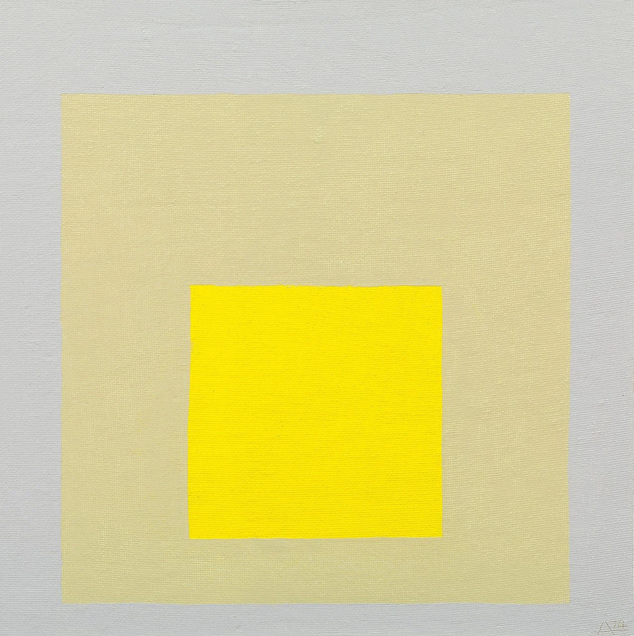
Josef Albers understood this more deeply than almost anyone working in the twentieth century. Albers was a painter and theorist, a Bauhaus master who later taught at Yale, and he devoted decades of his practice to studying a single phenomenon: how the same color changes completely depending on what surrounds it. The same square of color placed against a dark ground appears luminous, expansive, full of presence. Place the identical square against a lighter ground and it recedes, looks flat, loses whatever quality made it worth looking at. Nothing about the color itself changed. The ground changed. And the ground changed everything.

Josef Albers. Study for Homage to the Square, Guggenheim New York.
He called this the interaction of color, but what he was really describing is something more fundamental than color theory. Perception is relational. Nothing is read in isolation. Everything exists in context. And that context, the ground, is not passive or neutral. It is an active force that shapes what the figure can and cannot be, what qualities it can and cannot express, whether it shows up at all.
Josef Albers. Study for Homage to the Square, Guggenheim New York.
Paul Rand and the authority of context
Paul Rand, one of the most influential graphic designers of the twentieth century and the man responsible for the IBM, UPS, and ABC logos, understood figure-ground not as a perceptual curiosity but as the central argument of design practice. In 1986, Steve Jobs hired Rand to create the identity for his new company, NeXT. When Jobs asked to see multiple options, Rand's response was immediate and entirely without apology: no. I will solve your problem and you will pay me. If you want options, hire someone else.
In his presentation notes for the NeXT logo, Rand described the effect of the mark as coming from the sparing use of brilliant colors on a predominantly black ground, like stars in the sky. He was not describing an aesthetic preference. He was making a precise argument about context. The colors only worked because of what surrounded them. The mark only carried the authority it needed because of the ground it sat against. Change the ground and the figure loses everything that made it powerful.
From Paul Rand’s Next Logo presentation notes for Steve Jobs
This is where I want to say something that I think is one of the most underacknowledged things in conversations about why capable women find themselves consistently underread. We have been told that when something is not working, the figure needs refinement. Sharpen the messaging. Improve the delivery. Work on yourself. But the design diagnosis is often entirely different. The figure is fine. The ground is wrong.
Rachel Green understood this before any of us
I want to talk about Rachel Green for a moment, because she is one of the most precise illustrations of figure-ground that popular culture has ever produced, and I do not think anyone has named it as such.
Rachel starts Friends doing something that most people never do. She runs out of her own wedding. Full dress, full makeup, full awareness that what she is about to do will blow up her entire life. She does it anyway. Because the ground she was in, Long Island, wealthy family, dentist fiancé, country club future, was suffocating her. Not dramatically. Not with fireworks. Just quietly, persistently, in the way wrong rooms do. She looked perfect in that room. And felt nothing.
So she leaves. She lands, eventually, at Central Perk. And Central Perk is a better room than Long Island. She has freedom. She has her people. She is building something real. But here is where the figure-ground principle becomes impossible to ignore.

Rachel at Central Perk
Rachel has an eye. An instinctive, almost irrational understanding of beauty and quality, of the difference between something that is merely expensive and something that is actually good. At Central Perk, that is irrelevant. The ground does not call for it. So it sits there, invisible, exactly the way Albers described: the same quality, present and unchanged, rendered illegible by the wrong context.
She is fully there. And completely unseen. Then she enters fashion. Bloomingdale's. Ralph Lauren. Louis Vuitton. And the thing that was invisible at Central Perk becomes suddenly the entire point. The ground requires exactly what she has always carried. Rachel does not become a different person. She becomes fully legible for the first time.
Same figure. Different ground. The capacity was always there, but the wrong grounds simply could not hold it.
The wrong room
Every woman reading this has walked into a room where something felt off. A meeting, a pitch, a professional context where you found yourself working harder than the situation should have required. Explaining things that seemed like they should be obvious. Justifying a presence that your male counterparts never seemed to need to justify. And afterwards, because you are self-aware and conscientious, you did what you have been trained to do. You analyzed your own performance. You catalogued what you might have done differently.
But what if the room was simply wrong for you? Not wrong in a vague, motivational sense, but wrong in the specific, technical sense that Albers spent his career demonstrating. A context built around a different figure entirely, so that your presence inside it reads as somehow off not because you are off, but because the ground was never designed to hold you. The color did not fail. The ground failed the color.
The wrong room does not usually announce itself. It just quietly costs you. You are exhausted in a way that sleep does not fix, not because you are working too hard but because a significant part of your energy is going toward translation, toward managing the gap between who you are and what this room needs you to be. You keep tweaking. New positioning, new offer, new approach. Each version gets a little closer but never quite lands. You feel most like yourself in conversations that have nothing to do with your work. You attract people who almost get it, who want part of what you offer but not the whole thing.
And you can point to specific moments, specific rooms, specific conversations, where everything felt effortless. Where you did not have to explain yourself. Where what you are was exactly what was needed.
Those moments are not luck. They are data. They are showing you what your right ground looks like.
Construction versus excavation
When something is not working, the instinct is to build. Better messaging, a clearer offer, a more polished presence, a stronger personal brand. There are entire industries organized around helping people construct their way to visibility, and I understand the appeal because construction feels like agency. It feels like doing something.
But Michelangelo said something about his sculpture that I keep returning to. He said the sculpture already exists inside the marble. His job was not to create it but to remove everything that was not it. That is not construction. That is excavation. And I think the most important work, the work of finding a genuine point of view and a distinct way of seeing, is almost always excavation rather than construction. The thing is already there, shaped by everything you have lived and wrestled with and paid attention to over years. The reason it is not visible is rarely that it does not exist. It is usually that you have been building over it rather than uncovering it.
In design practice, before any work begins, you write a brief. Not a strategy document, not a vision board, but a precise articulation of what you are designing for, who it is for, and what it needs to do. The brief is what keeps a designer from spending six months building the wrong thing beautifully. Finding the right ground requires the same thing: a brief for your own point of view. Not introspection for its own sake, but diagnosis.
The excavation brief
There are three questions. Each one functions as a design diagnostic, and together they surface what is already there so you can begin to design around it rather than over it.
What have you always found yourself unable to walk away from, even when it made no practical sense?
Not what you are good at, and not what the market is asking for. The thing that kept pulling at you regardless of whether it was convenient or legible to the people around you. That pull is not a personality quirk or a distraction from serious work. It is data, and it points directly to where your deepest expertise lives and where your point of view is most likely to be genuinely your own rather than assembled from frameworks you absorbed from someone else.
Who is your mirror?
Not a target market or a demographic profile, but the specific person whose experience you understand from the inside. Either because you have lived it yourself, or because you have been close enough to it for long enough that it became yours in a different way. The precision of this matters enormously. Broad audiences are addressed. Specific people are understood. And work that understands its person lands in a completely different way than work that merely addresses a segment.
What is your lens?
Not what you do, but the way you see. The framework, implicit or explicit, that shapes how you diagnose what is wrong and recognize when something is right. It will feel too personal to be professional, too particular to be scalable. That feeling is exactly the signal you are looking for. The lens is what makes two people with nearly identical expertise produce completely different work, and it is what makes your version of a familiar service impossible to replicate.
Three questions. The drive, the mirror, and the lens. Together they surface something that no positioning exercise or brand strategy session can manufacture from the outside, which is a point of view that could not have come from anyone but you.
Recognition, not reinvention
Albers spent his career demonstrating that the same color reads differently against different grounds. Rand built some of the most enduring marks in design history by treating the ground as seriously as the figure. And Michelangelo understood that the work was always already there inside the material. The job was never to create it from nothing. The job was to remove what was covering it.
The figure you are working with has been shaped by everything you have lived, every room you have walked into and felt slightly wrong in, every moment of expertise that went unrecognized not because it was insufficient but because the context was not built to receive it. The work now is not to construct something new over the top of that. It is to answer the three questions honestly enough that the marble begins to fall away, and then to find, or build, the ground that was designed for your figure rather than against it.
When that alignment happens, you do not become more visible by trying harder. You become visible because you are finally in the right room, placed against a ground that can actually hold you. That is not reinvention. That is recognition.
If this resonated and you are wondering whether your website is currently working as the right ground for who you have become, this page outlines how Gumptious approaches that work. If you already know something needs to change and want to talk through it, get in touch here.