
Websites aren’t brochures: Here’s what they actually are.
In 1943, the American architect Frank Lloyd Wright completed the Guggenheim Museum in New York. The building took sixteen years from commission to completion, partly because Wright refused to treat it as a container for art. He treated it as an argument about how people experience art. The ramp that spirals from top to bottom was not a circulation solution. It was a position: that art should be encountered in continuous movement, not in discrete rooms you enter and exit. The building did not merely house the collection. It made a claim about what looking at art could be.
When it comes to a digital experience, most websites are the opposite of the Guggenheim. They are containers that hold information. They exist because a business needs somewhere to put its services page, its about page, its contact form. They were built to answer the question "where do I put this" rather than the question "what is this trying to do." And like any container designed without a position, they are passive. They wait. They hold things. They do not argue for anything.
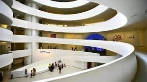
The famous Guggenheim staircase
The distinction between a container and an argument is structural, not aesthetic. And it is the single most consequential design decision a founder makes when she builds her online presence.
What a brochure actually is
A brochure is a document designed to be handed to someone who has already decided they are interested. Its job is confirmation, not persuasion. It assumes a context in which discovery has already happened, in which someone has already decided to pick it up. The brochure does not need to earn attention because attention has already been granted.
This is why the brochure model made sense for an earlier era of business websites. In the late 1990s and early 2000s, simply existing online was itself a differentiator. Having a website at all communicated something about the seriousness of a business. The site did not need to work particularly hard because its existence was enough.
That era ended over two decades ago. The web is not scarce anymore, and every business has a website. Every service provider has an about page and a services page and a contact form. The site that exists is not remarkable. What the site does is what matters, and most sites do very little.
The brochure model persists because it requires the least critical thinking. It answers a logistical question, where do I put information about my business, without asking the more fundamental question of what the information is trying to accomplish. It produces a site that is technically complete and strategically inert.
The thing a website is actually for
Here is the question that most website briefs never ask: what does a prospective client need to believe before she will reach out?
Not what information she needs. What she needs to believe.
Because the decision to contact a service provider is not primarily an information-processing decision. It is a trust decision. A prospective client who finds your website cold, with no prior context, no warm referral, no existing relationship, is not reading your services page to gather data. She is reading it to make an assessment. She is asking, consciously or not, whether the person behind this site understands her situation, whether the quality of thinking on display reflects the quality of work she would receive, whether she is in the right place.
Those questions are answered before anyone reads a word of copy. They are answered by the visual register of the site, by the coherence of the design, by the specificity or vagueness of the language in the first paragraph she sees. They are answered in seconds, through impressions that are difficult to articulate but very easy to act on.
This is why treating a website as a container for information misses what websites actually do. A website is not a place where a prospective client goes to gather information. It is a place where she goes to form an opinion. And the opinion she forms in the first thirty seconds she spends there is extraordinarily difficult to revise, no matter what she reads on page three.
The architecture of a site that works
Frank Lloyd Wright understood that a building shapes the experience of everyone who moves through it whether they are aware of it or not. The Guggenheim's ramp does not announce itself as a design philosophy. It simply makes a particular kind of encounter with art inevitable by the way it organizes movement.
A website that works operates on the same principle. It does not announce its strategy. It enacts it.
The first thing a prospective client sees needs to answer a question she has not yet asked out loud: am I in the right place? Not through a value proposition statement. Not through a list of credentials. Through language that is specific enough that she feels recognised. The difference between language that is broad enough to describe any service provider and language that describes her particular situation is the difference between a site that processes traffic and one that converts it.
This specificity is harder to achieve than it sounds because it requires genuinely understanding who you are speaking to. Not a demographic, not an archetype. A SPECIFIC situation. The woman who has built a serious service business over several years, whose work has become more sophisticated and more valuable, whose positioning has sharpened, but whose online presence still reflects where she was when she launched. She looks at her own website and feels the gap between what it says and who she has become. That gap is costing her, in the quality of enquiries she receives, in the rates she is able to hold, in the way prospective clients treat her before a call.
That is a specific situation. A site that speaks to it, that names it with accuracy, does something a brochure cannot do. It makes a claim, and says: I understand what you are dealing with, not in a general sense but in the specific sense that makes you feel understood before you have told me anything.
What this looks like in practice
The about page is the most instructive place to see the difference between a brochure and an argument.
Most about pages are biographical. They list the founder's background, credentials, experience, and values. They are written in the third person or in a first person that maintains a careful professional distance. They answer the question "who are you" but they do not answer the question the prospective client is actually asking, which is "why does your background matter to my situation."
The gap between those two questions is enormous. Thirteen years of Fortune 500 digital product design experience is a fact about the founder. Its relevance to a Canadian woman founder who is trying to figure out why her website keeps attracting underbudget enquiries is not self-evident. The about page that makes that connection explicit, that explains how a particular professional history shaped a particular way of seeing design problems, is doing something the credential-list cannot do. It is making an argument for why this specific person is the right choice for this specific situation.
The services page is where the brochure model is most damaging. Most services pages describe deliverables. What you receive, how many pages, what is included, what the timeline looks like. This framing invites comparison. If your services page describes what you get, a prospective client will compare your what-you-get to every other designer's what-you-get. She will make her decision on price and inclusions because those are the only legible variables you have given her.
A services page that describes what changes, what is true about the business after the engagement that was not true before, is doing something categorically different. It is not inviting comparison. It is describing an outcome that she either wants or does not, and if she wants it, the question of who else offers it becomes much less central to her decision.
The objection worth addressing
There is a version of this argument that gets made in every brand strategy conversation and that sounds like: just be more confident, just be more direct, just take up more space. As if the problem is timidity and the solution is volume.
That is not what this is about.
Specificity and confidence are not the same thing. A site can be extremely direct and still be completely generic. The confidence that makes a site work is not the confidence of asserting yourself loudly. It is the confidence of knowing your person well enough to speak to her situation with precision. It is the confidence of having a genuine point of view on what you do and why your way of doing it produces different outcomes than someone else's.
That kind of confidence cannot be performed. It can only be earned, through the accumulation of enough client experience and enough genuine reflection on that experience that you actually know something specific about the situation of the person you are trying to reach. When you know it, the site can reflect it. When you do not, no amount of brand voice work will substitute for the knowledge.
This is also why the timing of a website redesign matters more than most people acknowledge. A site that was built before a founder had accumulated enough experience to know her person with precision will always feel slightly off, not because the designer did a poor job but because the brief was incomplete. The clarity that makes a site work comes from inside the business, from the founder's genuine understanding of who she serves and what changes for them. Design makes that understanding visible. It cannot create it from nothing.
The compounding problem
A website that is not working does not stay static. It compounds.
Every prospective client who visits and leaves without reaching out is a data point the founder never sees. She does not know that the site is causing the loss because she only knows about the clients who do reach out. The clients who did not reach out are invisible. The site that is failing is failing silently, and the founder who does not know it is failing is spending her time on other things: on referrals, on networking, on social media, on proposals, on all the other ways she is trying to build a pipeline that her website should be supporting.
Meanwhile the site stays as it is. Because changing a website is a significant undertaking and because the founder cannot trace her pipeline problems to the site she does not think of it as the problem. She thinks the problem is somewhere else.
This is the compounding nature of the wrong site. It does not just fail to generate business. It occupies the position that the right site could be occupying, against the same competitors, in the same searches, with the same prospective clients. The cost is not just the clients who are not coming in. It is the clients who could be coming in if the site were doing what it should be doing.
Where to start
The clearest diagnostic question is this: if a prospective client who does not know you lands on your site and spends two minutes there, what does she believe about you when she leaves?
Not what does she know. What does she believe.
If the answer is uncertain, or if the answer is something generic like "she knows what I offer" rather than something specific like "she understands exactly who I work with and why my approach produces different outcomes," the site has room to develop.
The work is not a rebrand. It is not necessarily a redesign. It is a reckoning with what the site is actually arguing, as opposed to what it is containing, and whether that argument is the one you would make if you sat down with your ideal client and had thirty seconds to tell her why she should reach out.
That argument, made with specificity and without apology, is the difference between a brochure and a business asset.
For Canadian women founders who are building service businesses at a premium level and want a website that makes that argument clearly, this page outlines how Gumptious approaches that work.
If you already know your site needs work and want to talk through it, get in touch here.