
Why no one understands what you do (and how to fix it)
Most women trying to get clear on their positioning keep doing the same thing. They add. More copy, more credentials, more explanation, more proof. And the more they add, the further they get from clarity. This is about why — and what to do instead.
The assumption buried in every piece of positioning advice
There is a particular kind of woman who comes to positioning work already exhausted. She has done everything the advice told her to do. She has workshopped her messaging, refined her bio, layered in her credentials, built out her offer suite, added more context to every touchpoint where someone might not immediately understand what she does. She has treated the problem of not being seen as a problem of insufficient information, and she has responded to it with more information.
And she is further from clarity than when she started.
I see this constantly, and I want to name what is actually happening, because it is not a failure of effort or intelligence. It is a failure of diagnosis. The assumption buried inside almost every piece of positioning advice — refine the copy, clarify the offer, add more proof — is that visibility is something you build toward. That if you just get the language precise enough, the structure complete enough, the presence polished enough, something will finally click into place.
But there is a design principle that suggests the opposite is true. That clarity is not something you construct. That the reason your positioning is not landing has nothing to do with what is missing, and everything to do with what is in the way.
What negative space actually is
Negative space is one of the most foundational principles in design, and it is almost universally misunderstood by people who have not spent time working with it deliberately.
The common assumption is that negative space is the empty part. The background. The area of a composition where nothing is happening. But this misses what negative space actually does, and why designers who understand it well treat it as the most active element in any composition rather than the most passive one.
Negative space is the force that defines the edges of a form. It gives a shape its boundaries, its legibility, its ability to be read clearly rather than searched for inside a field of competing visual noise. Without negative space, there is no form, there is only chaos; a density of marks that the eye cannot resolve into meaning because nothing has been given room to exist as a distinct thing.
The reason a great logo reads instantly, at any size, across any context, at any distance, is never because the mark is louder or more complex than its competitors. It is almost always because everything competing with it has been removed. The negative space is not where the designer stopped working. It is, in many cases, where the designer worked hardest, making the hundreds of decisions about what to take away so that what remained could finally be seen.
This principle runs through the entire history of serious design thinking, and it is worth tracing briefly, because understanding how it works helps clarify why it matters so much for the specific problem of positioning.
A short history of subtraction
The Bauhaus, the German design school that shaped nearly everything about how the modern world looks, understood negative space and subtraction as founding principles rather than stylistic preferences. Their mantra: strip away ornament, remove decoration, let the function of a thing speak for itself without the interference of everything layered on top of it in the attempt to seem important or impressive.
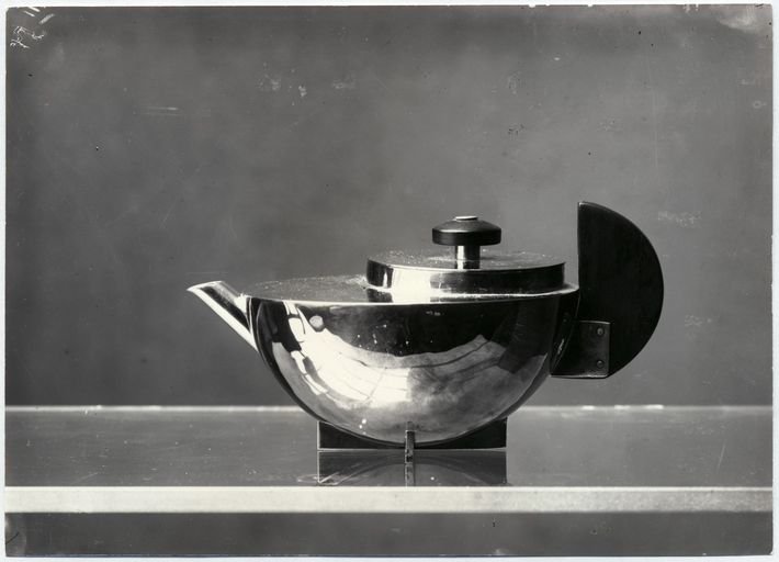
Teapot by Marianne Brand, 1924.
What looks like simplicity from the outside is actually the result of enormous discipline. The decision of what not to include is consistently harder than any decision about what to add, because addition feels like progress and subtraction feels like loss, even when subtraction is exactly what is needed. The Bauhaus commitment to removal gave their work a clarity and longevity that the ornamental tradition it replaced simply could not match, because clarity compounds over time in a way that noise never does.
Jan Tschichold carried this principle directly into typography and page layout. He came up in an era of Victorian excess, pages crowded with type that was ornate and layered with decoration until the message was almost incidental to the noise surrounding it. His response was not to create a new decorative style but to articulate a philosophy of removal. Whitespace was not empty in his framework. It was structural. It was the force that allowed text to be read, the silence that made the signal possible. He understood something that designers still struggle to hold onto in practice: the page is not waiting to be filled. It is waiting to be cleared.
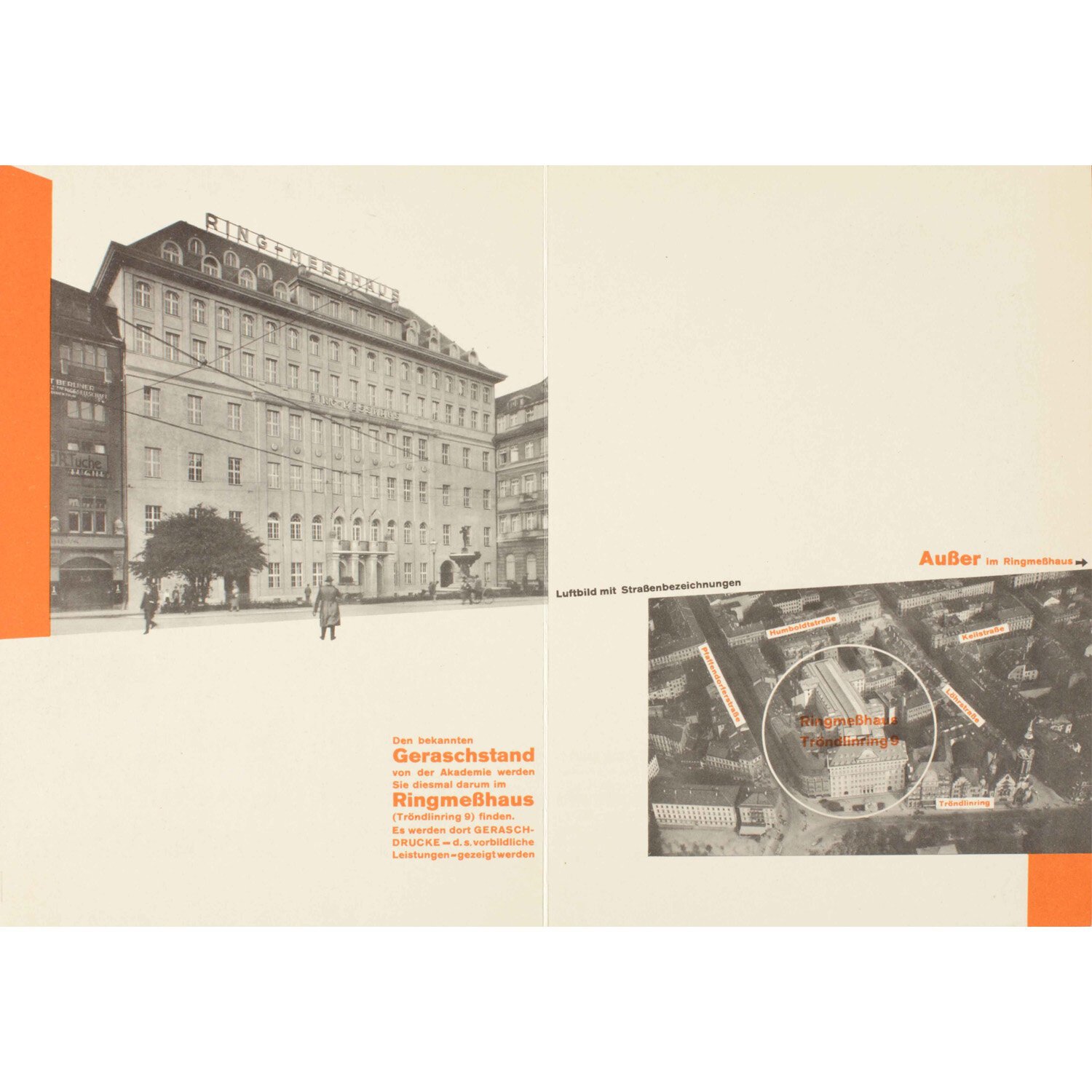
Internal spread from brochure advertising the Emil Gerasch print studio: Merken Sie sich bitte: Die Reklamemesse (Take note: The Advertising Trade Fair), 1927
Japanese design philosophy has a concept for this that translates imperfectly but usefully as ‘ma,’ meaning negative space or interval. Ma is not absence. It is the pause that gives meaning to what surrounds it, the gap between notes that creates music rather than noise, the space between elements that produces relationship rather than collision. It is not where nothing is happening. It is where everything is held, structured, and made comprehensible.
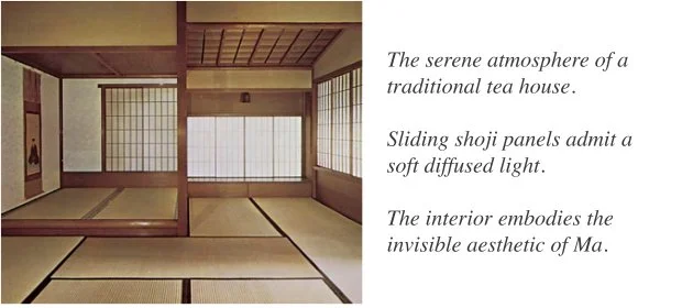
A Japanese Tea House
Massimo Vignelli, one of the most influential designers of the twentieth century and the man behind the New York City subway map and the American Airlines identity (amongst many other famous works), lived this philosophy in practice with a rigour that made him occasionally difficult to work with, but consistently ahead of everyone around him. He believed that most design failures were failures of addition, that designers and clients kept putting things in because they were afraid that what was already there was not enough. His response to that fear was not reassurance but removal. He understood that restraint is not timidity. It is confidence in the form. The willingness to remove is the willingness to trust that what remains is sufficient.
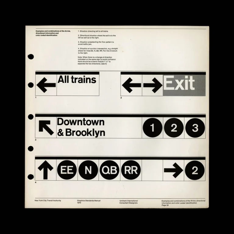
Different sign combinations to show how a strictly minimal system could adapt to the complex labyrinth that is the New York City Subway. Design by Massimo Vignelli, Graphic Standards Manual for the NYC Transit Authority.
And then there is Michelangelo, who was not a designer but who gave us perhaps the clearest articulation of this principle anyone has ever managed. He said that the sculpture already exists inside the marble, that his job was not to create it but to remove everything that was not it. That is excavation, and not construction. This idea reframes the entire problem of clarity, in design and in business, from something you build toward into something you uncover by removing what does not belong.

Michelangelo, Atlas 1530-34
Why this is a positioning problem?
When a woman cannot get clear on her business’ positioning, the instinct is always to add. More explanation, more context, more credentials, more carefully worded descriptions of her methodology. And each addition makes the underlying form slightly harder to see, because the eye, like the mind, cannot resolve meaning from density. It needs edges. It needs boundaries. It needs enough space around a thing to read it as a distinct form rather than part of a field.
“Negative space is the force that defines the edges of a form. It gives a shape its boundaries, its legibility, its ability to be read clearly rather than searched for inside a field of competing visual noise. Without negative space, there is no form, there is only chaos; a density of marks that the eye cannot resolve into meaning because nothing has been given room to exist as a distinct thing.”
The women who are furthest from clarity in their positioning are almost always the ones who have added the most. The most thoroughly explained bios, the most layered proof points, the most careful hedging of their language to make sure no possible audience is excluded. They have not built their way to clarity. They have buried themselves under the attempt to achieve it.
What they need is not another layer, but subtraction. The removal of everything that is not the thing, until the thing can finally be seen with the kind of clarity that makes it immediately legible to exactly the right person.
This is what I mean when I say that the most important design skill no one taught you is not a production skill. It is a removal skill. The ability to identify what does not belong and take it away, not because it is bad but because its presence is preventing something more essential from being visible.
My story of subtraction
I want to be honest about where I learned this, because it did not come from a book or a framework. It came from a period of my own work that was genuinely disorienting.
I have a background in graphic design. It was where I started, the first language I learned for seeing the world, the discipline that taught me to look at the relationship between a form and the space around it as the fundamental unit of meaning in any composition. And then I spent fifteen years in the corporate world, solving large-scale digital problems for large organizations. Strategy, design systems, issues related to scale. The kind of work that rewards certain ways of presenting yourself and quietly discourages others.
The graphic design receded. I didn’t make a decision to leave it behind, but I just kept building over it. The corporate context rewarded legibility in a particular register, and I learned to foreground the things that registered as credible in that world and let the rest go quiet. I constructed a professional identity that worked. Until I started my own practice, and suddenly had to answer the question that every woman faces when she steps outside the context that has been organizing her sense of self: who am I now, outside of this identity that I had constructed so meticulously?
My first instinct was to get back to it, to construct something new and fresh. A new identity, a new framework, a new way of presenting myself that would make sense to a different audience. It took me longer than I would like to admit to understand that this was exactly the wrong approach. The answer was not construction. The graphic design had never left. The obsessive attention to letterforms and negative space and the relationship between a mark and what surrounds it was there the whole time, underneath everything I had built over it in the attempt to be legible in a world that did not have a ready category for it.
When I stopped building over it and started removing what did not belong, something became visible that had been there for decades. In a world of AI-generated-everything, where the generic is infinite, free, and so easily available, that particular accumulation of attention and craft reads with a clarity it has never had before. I did not construct that positioning, I just removed everything that was not it.
Three questions that are instruments of removal
Which brings me to the practical work, because this principle needs a method or it stays abstract.
“Three questions. Three acts of removal. Who, what, and how. Not assembled to construct something new, but used to clear away everything that has been obscuring what was already there.”
The three questions I use with my own clients (and for myself) are not prompts for construction. They do not ask you to invent something or assemble something or build something new, like a new morning routine or a way to organize your calendar. Each one asks you to draw a boundary, to say this and not that, here and not there, this person and not the thousand other people you could also theoretically serve. And in drawing those boundaries precisely enough, something appears in the space between them. Not something new, but something that was always there, obscured by everything built around it in the attempt to be legible and palatable to everyone.
1// Who is the person whose problem you understand so completely, and whose transformation you care about so unreasonably, that you would do the work even if no one was watching?
Not a target market, not a demographic profile with income brackets and psychographic overlays. A person, specific enough that you can almost see her. Most women, when they answer this question honestly, discover they have been designing for a projection, a composite that is slightly broader and safer and less specific than the real person, because specificity felt like it was leaving people out. But specificity is the negative space doing its work. The moment you name who she actually is, precisely and without hedging, everyone else falls away and what remains is a figure with edges. Someone you can actually design for.
2// What is the problem you are unreasonably interested in?
Not the problem you are qualified to solve, and not the problem that exists in a large enough addressable market. The one that genuinely bothers you when it goes unsolved. The one you have opinions about that you have been keeping to yourself because they felt too strong, too particular, too much like just your perspective to be professionally useful. That unreasonable interest is not a liability. It is what remains when you remove everything you think you are supposed to care about. It has been there the whole time, underneath the hedging and the careful professional language and the attempt to position yourself for the widest possible room.
3// What is the lens that is distinctly yours?
Not what you do, and not your service category, but the way you see. Every person who solves a problem brings a perspective to that problem, an implicit or explicit framework that shapes how they diagnose what is wrong and recognize when something is right. That lens is almost always formed from a combination of experiences and disciplines that nobody else has in quite the same configuration. It feels too personal to be professional, and too particular to be scalable, basically, too much like just the way you happen to think. And so most women remove it. They sand down the edges of their perspective until it sounds appropriately neutral and safe enough to put on a website. But that sanding is not subtraction in the Tschichold sense. It is removing what does belong, which is the opposite of the work. Your lens is the most load-bearing element of your positioning. It is what makes your work irreplaceable rather than interchangeable.
Three questions. Three acts of removal. Who, what, and how. Not assembled to construct something new, but used to clear away everything that has been obscuring what was already there.
What remains when you stop adding
The Bauhaus stripped away ornament so the function could speak. Tschichold cleared the page so the message could land. Vignelli removed everything he did not trust, and trusted what remained. And Michelangelo understood that the sculpture was never the problem. The marble around it was.
Your positioning already exists. It has been shaped by everything you have lived, every problem you have wrestled with, every client you have sat across from, every moment you looked at something broken and knew immediately what was wrong with it. It is not waiting to be built from scratch. It is waiting to be uncovered, which is a completely different kind of work, and in many ways a harder one, because it requires you to trust that what is already there is enough.
Answer the three questions honestly, draw the boundaries clearly, and the marble begins to fall away. You will not uncover something new, but you will finally stop building over what was always there. And that is wholly, completely, YOURS.
That is not construction, but recognition. And the willingness to stop adding, to put down the tools and let what remains be enough, is not giving up. It is THE work.
If you are ready to do that work, get in touch!